Please use this thread to ask any questions regarding the full release coming this November.
Please use this thread to ask any questions regarding the full release coming this November.
Some observations after few days of using the new UI
1. Old four window home screen is greatly missed. One could easily see what was going on at one glance
2. location of search bar is odd. Is there a reason it is now located on the top right corner, when you get your results on the left side?
Please find responses below to the questions we couldn't answer during the webinar's New Desktop User Interface Customer Information Q&A session.
1. Can we install the update and revert the registry setting to stay on the old user interface for a while?
Unfortunately, once the update is applied, you cannot revert to an older version.
2. We are set up for automatic updates but still have not received the update for the new release. Is there something extra I need to do as an Admin?
A couple of options to explore: (1) on one of the workstations, please try to force the update by going into M-Files desktop settings; you can find this setting from the taskbar on your computer, next to Wi-Fi, battery, etc. on the lower right corner: M-Files icon > Settings > automatic updates (2) it is also possible there is a set installation date which can also be reviewed in the desktop settings and (3) if you the error persist after executing a reboot, please contact customer support.
3. What is the first M-Files server version which supports the new client?
The M-Files server version for this new release is 22.11
4. Will this presentation be available online via a link?
Yes, the webinar will be available in the Community: https://community.m-files.com/learning-resources/m/event-videos/95 in an on-demand format.
5. Is the update likely to impact developments made during the configuration of the vault?
No, they shouldn't be any impacts. It would only impact the theme editor you use for the theming feature.
6. We never enabled the Manage Client Settings under the Advanced Configuration. When going in and enabling the setting to allow for a Single metadata card popup only, It tells us this can cause unwanted effects in the vault. What would this affect if we were not using this feature in the past?
If this feature was never enabled, there should be no unwanted side effects.
Hi
To add to the above My Recently Accessed 'documents' is clear of all documents bar one and yet I updated lots of documents last week. Anyone else had this or is this a support issue?
Thanks
K
I think that the 3 wide web interface is a must, I honestly thought that was going to be included in this update(the whole "Web and Desktop Parity" part) and am extremely disappointed it wasn't since I know a lot of the complaints coming from my customers are about viewing both at the same time and not having to have to pop out the window.
I think the drag and drop for pinned would be great. There's got to be another solution for the quadrant problem, I honestly believe that there is a ton of wasted/white space in that area now thanks to the new interface. What used to show 4 categories now shows 1 and honestly, the ,checked out to me and very often the assigned to me do not need about half a screen(3 wide would solve a lot of this). I like to make sure my view permissions are very strict so only people who need to see a view see it so I also think there is a lot of wasted space here and typically people only care about the top 10 to 20 recently accessed.
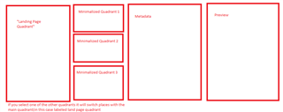
M-Files came up with the great idea of quadrants and I am not saying that's the best solution but what is in place now isn't better. Maybe a visual update or a better way to organize these quadrants would of be better. Something like if they selected something in one of the quadrants, that quadrant expanded to take the vertical space of itself and the quadrant below it pushing the other 3 parts of the quadrants to the left or right.
This could even be done in a way where you can have your landing page functionality still making it the dominant quadrant but then the other 3 are sort of... minimalized. A picture to demo:
Above is just an idea, this would give the active quadrant more priority but still show relevant information that the other quadrants show.
Hi,
We've come across what appears to be a bug in the new UI.
Sometimes when a user goes to change the state of a document or object, the state transitions do not display.
This is rectified by discarding changes and then going to change the state again. On the second time the relevant transitions are displaying properly, but nonetheless this causes confusion for some users when they don't see the expected state transition options the first time around.
Thank you for reporting the issue, we will take a look into it and try to provide a fix in the upcoming (near-future) releases.
© 2025 M-Files, All Rights Reserved.