

At M-Files, we are actively investing in the user experience and want to keep continuously improving our products. This investment will lead us to launch several small and big updates during this year.
We are also making changes to the way we focus on end-user needs, as we want to make M-Files a product that is not only highly functional and secure but also a pleasure to use. We want M-Files to be more personal and better tailored to user needs and practices, while also providing easier ways to find and manage the information that matters.
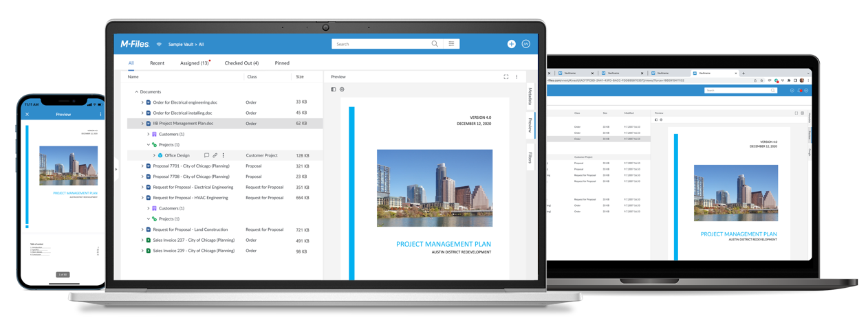
M-Files Desktop application our key product, accessed by tens of thousands of users daily. We are now thoroughly updating the user interface, modernizing it, and aligning it with our brand look and feel.
Reasons For This Change
We are updating M-Files' User Interface for these reasons:
1. Utilizing the Latest UI Libraries
digital products need to be constantly updated to keep them on edge and ensure overall high quality. The main UI of the Desktop app design is now modernized, using the latest UI libraries, and providing a fresh look and feel.
2. World-leading Usability
We strive for world-leading usability. A big part of this is achieved through a clear visual hierarchy and easy-to-locate main controls for knowledge workers. We achieved this by simplifying the main view, doing away with the heavy borders between views, and making it easier for users to focus on content and navigate around the UI.
3. Brand Alignment
We want to align the design with our range of applications to build a stronger brand identity, sense of quality, and improve the consistency of the user experience, even if users operate across other M-Files versions like Web and Android / iOS Mobile applications.
What’s Changing?
In terms of look and feel, the main view layout has been significantly simplified, resulting in a lighter, borderless look. Four separate windows on the left are gone - instead, there is one big, clear main view panel. The new design offers better information layering, less distraction, and enhanced readability.
Functionally, there are several improvements we've made to bring an enhanced layout for an effortless document management experience.
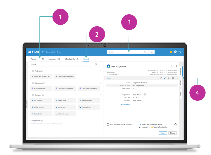
- Main Navigation: Better visibility with a simplified navigation panel view will give you access to choose your desired default view.
- Pinned View: This strengthens our pinned view giving it a new location and grouping functionality for a smarter way to organize your vital documents.
- Search Bar: A faster way to navigate M-Files with an easier way to locate our search bar and create button.
- Panel Tabs: Cleaner design to navigate through your documents' information by repositioning the right panel tabs vertically on the right.
Our Customers Have Spoken
Before finalizing the product for launch, we did extensive user testing with both European and North American customers in spring 2022. The overall feedback was very positive, as people liked the clean and modern look while all the M-Files functionality was still there and easy to find. The learning curve for taking the new design into use was very short. "It's fresh but familiar!" was one of the user quotes. All in all, we are very proud of this new design and are ready to roll it out to our customers .
Antti Kujala is the Head of Design at M-Files. Antti has over 20 years of creative leadership experience and has previously led successful design strategies and digital solution creation in senior roles for global consumer brands such as Nokia, Suunto, Atomic, and Bang & Olufsen. He is a firm believer in user insight -led design methodology. Antti joined the company in December 2021.