
I had asked for this change through M-Files support and I was hoping that I would have been included in the latest version release.
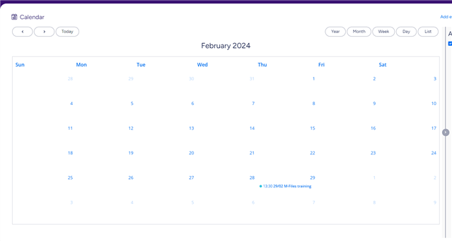
My problem has to do with the alignment of dates and events. Because there are no gridlines, sometimes is not always clear if an event takes place on one day or the other. The name of the day and the event are flushed to the left and the date is flushed to the right creating some confusion.
See the example. This UX could be improved. Many of our users have accessibility requirements and it is really difficult for them.
Please let me know if this is something that I could fix on my end.
Regards
Irene